Animating GridViewItems with Windows.UI.Composition (aka the Visual Layer)
If you’ve ever used the beta version of myTube! (and you should), you’re probably familiar with the effect I wanted to create:

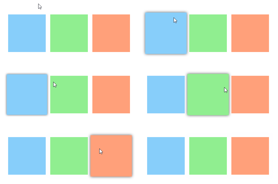
I absolutely love this effect, and when I accidentally open the non-beta version of myTube, where it’s not yet implemented, I miss it, often to the point of closing the app and opening the beta. It really makes for a great experience, so I wanted to create something like it myself. Here’s the result of what we’ll build in this post:
XAML
Let’s start with the XAML we’ll use to define the GridView:
<GridView SelectionMode="None" IsItemClickEnabled="True" HorizontalAlignment="Center" VerticalAlignment="Center" Padding="16">
    <GridView.ItemContainerStyle>
        <Style TargetType="GridViewItem">
            <Setter Property="Margin" Value="6" />
        </Style>
    </GridView.ItemContainerStyle>
    <GridView.Items>
        <SolidColorBrush Color="LightSkyBlue" />
        <SolidColorBrush Color="LightGreen" />
        <SolidColorBrush Color="LightSalmon" />
    </GridView.Items>
    <GridView.ItemTemplate>
        <DataTemplate>
            <Grid Loaded="Item_Loaded">
                <Rectangle Fill="{Binding}" Height="100" Width="100" />
            </Grid>
        </DataTemplate>
    </GridView.ItemTemplate>
</GridView>
This creates a GridView with three rectangles in the colors defined in GridView.Items and enough spacing between them to fit
the scaled-up rectangle and its shadow. Notice the
Item_Loaded event handler in the ItemTemplate,
that’s where we’ll set up our animations.
The Visual Layer
Before we go on and animate the GridViewItems, its worth to take a look at the technology we’re going to use. The Visual layer is the part of the Windows UI stack that supports the XAML Framework. This means that every XAML element has a representation in the Visual layer, but also that you could draw your entire application using the Composition API (the API surface of the Visual layer) without ever touching any XAML. Or build an alternative UI framework, if that’s your type of thing. The Visual layer also provides a way to do animations, lighting and shadows, and numerous effects.
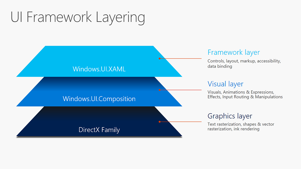
Of course, there’s a way to get the Visual of any XAML element, which
can then be used with all the magic of the Composition API. This is done
using the ElementCompositionPreview.GetElementVisual()
method, which returns the backing Visual for any XAML element. Besides
the generic Visual type (which
GetElementVisual() returns) there are two deriving classes: a ContainerVisual, which is a Visual that has the ability
to create children; and a SpriteVisual, which can be
associated with a brush, so that it can render images, solid colors,
effects etc. The latter two are more useful when creating Visuals using
Composition, rather than manipulating XAML generated Visuals.
The last important part of the Composition API that I want to mention
here is the Compositor, which is the class that brings all
Composition elements together. It is used to create visuals and
animations (as well as lights, brushes, easing functions and other
related things), and it makes sure that changes to visuals are actually
applied and shown on the screen.
Scaling our rectangle
We start by having the Item_Loaded event handler call a
method to set up our animation, which takes a UIElement to animate. The
sender of the event (the Grid in the
ItemTemplate) is passed into that method:
private void Item_Loaded(object sender, RoutedEventArgs e)
{
    var root = (UIElement)sender;
    InitializeAnimation(root);
}

private void InitializeAnimation(UIElement root)
{
    // Here comes the interesting stuff
}
Inside InitializeAnimation() we first have to get the
Visual that backs the XAML element we got as the root
argument. For this we use the ElementCompositionPreview
class I already mentioned. We also get the compositor from the visual we received:
var rootVisual = ElementCompositionPreview.GetElementVisual(root);
var compositor = rootVisual.Compositor;
Then we use the compositor to create a new
Vector3KeyFrameAnimation. Let’s decompose that word to
understand what we’re doing. First of all, it’s an Animation,
specifically a KeyFrameAnimation, which means that we can give it some
information about what we want the values to be at some points in time
and it will figure out the full animation from that. It animates a
System.Numerics.Vector3, also known as a 3-dimensional
vector. For those not familiar with linear algebra, it simply represents
a point in three-dimensional space, with an X, Y and Z coördinate. We
need a Vector3 in this case because we want to animate the
Scale property of our visual, which is a Vector3 for
scaling a visual in three dimensions, where the coördinates are not a
point in space, but the scale multiplier in that direction.
(I’m not sure what it means to scale an element in three dimensions
in this case, especially because the Size property of a
visual is a two-dimensional vector with just width and height. Please
let me know if this makes sense.)
var pointerEnteredAnimation = compositor.CreateVector3KeyFrameAnimation();
pointerEnteredAnimation.InsertKeyFrame(1.0f, new Vector3(1.1f));
When the pointer enters the element, we want to scale it up by 10%,
so we add a keyframe at the end of the animation with a value of a
Vector3 with three times 1.1, to scale 1.1 times as big in all
directions. The first float is a normalizedProgressKey, so
0.0 is always the start of the animation and 1.0 the end, independent of
the duration. If there’s no start value defined (i.e. at key 0.0), the
current value of the animated property is used.
Similar to the pointerEnteredAnimation, we can define an animation for when the pointer exits the element, animating the scale back to 1.0:
var pointerExitedAnimation = compositor.CreateVector3KeyFrameAnimation();
pointerExitedAnimation.InsertKeyFrame(1.0f, new Vector3(1.0f));
Now the only thing left to do is starting the animation when the pointer enters or exits or element:
root.PointerEntered += (sender, args) => rootVisual.StartAnimation("Scale", pointerEnteredAnimation);
root.PointerExited += (sender, args) => rootVisual.StartAnimation("Scale", pointerExitedAnimation);
A Visual has a method to start an animation on one of its properties. The first argument is the name of the property you want to animate (yes, as a string, wait until we get to expressions), the second is the animation.
And that’s the result:

The animation works. But there are some problems design-wise: the animation plays oriented from the upper left corner, so the rectangle seems to expand on the right and bottom side, not from the center; and the hover border of the GridViewItem is shown inside the rectangle.
Some small improvements
First, we’ll make the animation play from the center. The Visual
class has a property CenterPoint, which defines the point
from which the visual is scaled and around which it is rotated. I’ve
found that the best place to set the CenterPoint is in the
PointerEntered event handler, right before starting the animation:
root.PointerEntered += (sender, args) =>
    {
        rootVisual.CenterPoint = new Vector3(rootVisual.Size / 2, 0);
        rootVisual.StartAnimation("Scale", pointerEnteredAnimation);
    };
Here we set the CenterPoint (a Vector3 again, so you can also set the
depth of the center) to the center of the visual by using the
(Vector2 XY, float Z)-constructor. This will make sure all
animations look centered when the pointer enters the item. Setting it
again in PointerExited is not necessary unless you’re planning to change
the size (not to be confused with scale) of the element while the
pointer is on it. If you’re not changing the size of the element at all,
it might seem more logical to set the CenterPoint when also creating the
animations etc., but I’ve found during my experiments that that will
result in CenterPoint <0,0,0> because the returned Size is
<0,0>. I’m not sure why that happens, so again, please let me know
if it makes sense.
Next, I decided to entirely remove the hover and reveal borders of
the GridViewItem. They’re no longer useful because we already have a
differentiated hover state and they only add useless clutter. Removing
the borders involves retemplating the GridViewItem, and since the
template for a GridViewItem is rather large, I won’t paste it here, but
it can be found in this
Gist. In case you want to do it yourself: instead of the default
GridViewItem style, I based it on the GridViewItemExpanded
style, which you can find in generic.xaml, which already
removes the Reveal effects. In the template, I simply removed the
BorderRectangle and all references to it. Then that does
the job:
<GridView.ItemContainerStyle>
    <Style TargetType="GridViewItem" BasedOn="{StaticResource BorderlessGridViewItem}">
        <Setter Property="Margin" Value="6" />
    </Style>
</GridView.ItemContainerStyle>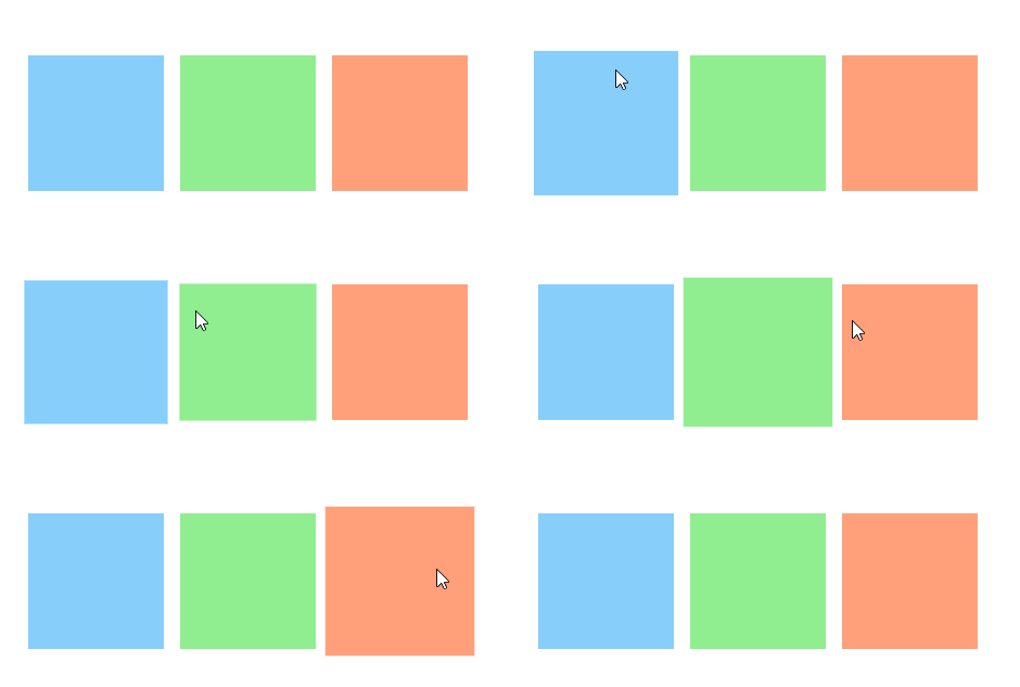
Adding a shadow
To really give a sense of depth when scaling up the rectangle, I wanted to add a shadow. To create a shadow you need a XAML element of the same size as and behind the element that casts the shadow. Then using the Composition API you can create a SpriteVisual, to which you add the shadow. Finally the shadow visual is added to the XAML element.
So first we need a container (e.g. a Canvas) for the shadow behind our rectangle:
<Grid Loaded="Item_Loaded">
    <Canvas x:Name="ShadowContainer" />
    <Rectangle Fill="{Binding}" Height="100" Width="100" />
</Grid>
To create the shadow in InitializeAnimation(), we also
need to know where to put our shadow, so now the method takes a second argument:
private void InitializeAnimation(UIElement root, UIElement shadowHost)
{
    ...
}

private void Item_Loaded(object sender, RoutedEventArgs e)
{
    var root = (UIElement)sender;
    InitializeAnimation(root, FindVisualChild<Canvas>(root));
}
The FindVisualChild method returns the first child of a type and is adapted from here. You can also find it in this Gist.
Now back to InitializeAnimation. First, we get the
visual for our Canvas (shadowHost, from now on), we’ll need that later.
Then we create a new DropShadow, set its color, create a new
SpriteVisual to hold the shadow, add the shadow to that visual, then add
that visual to the shadowHost.
var shadowHostVisual = ElementCompositionPreview.GetElementVisual(shadowHost);

// Create shadow and add it to the Visual Tree
var shadow = compositor.CreateDropShadow();
shadow.Color = Color.FromArgb(255, 75, 75, 80);
var shadowVisual = compositor.CreateSpriteVisual();
shadowVisual.Shadow = shadow;
ElementCompositionPreview.SetElementChildVisual(shadowHost, shadowVisual);
We also need the following snippet to resize the shadow as the shadowHost changes size. I’ll explain how it works later when we write our own ExpressionAnimation.
var bindSizeAnimation = compositor.CreateExpressionAnimation("hostVisual.Size");
bindSizeAnimation.SetReferenceParameter("hostVisual", shadowHostVisual);
shadowVisual.StartAnimation("Size", bindSizeAnimation);
With this code we have added shadows to our rectangles:
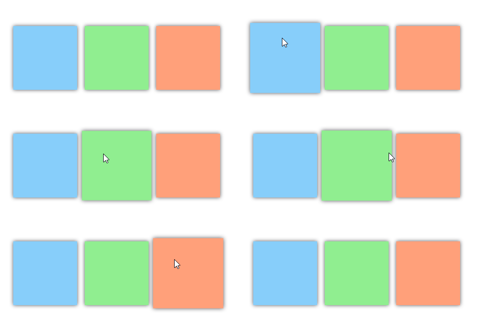
The next step is, of course, to animate the shadow, so that it
doesn’t show when the Scale of the rectangle is 1.0, and it shows
increasingly when the rectangle is scaled up. To achieve this we can
animate the BlurRadius property of the shadow. And to do
this we’ll have to use an ExpressionAnimation, so let’s take a look at
how those work.
Expression animations
The way I think about an expression animation is like a binding,
possibly with a converter. Let’s take a look at the resizing snippet to
see what I mean. The result of that animation (read binding) is that the
shadowVisual always has the same size as the shadowHostVisual. An
ExpressionAnimation is created with the expression
"hostVisual.Size" (I promised you, more strings) and in the
next line "hostVisual" is defined to be a
reference to the shadowHostVisual. The resulting animation
always returns the value of shadowHostVisual.Size. To bind
that value to the size of the shadowVisual, the animation is started on
the Size property.
Binding the size is a fairly simple application of the Expression language, which allows you to do much more powerful things by using the available keywords and functions. You can also set various numerical values as parameters, not just references to visuals, so that you can build generic expressions.
It’s also worth noting that an expression animation has no finite
duration, so it doesn’t end by itself. For an animation that’s unusual,
but it makes sense if you’re thinking about it as a binding. Of course,
you also have to make sure that the resulting type of the expression is
the same as the type of the property you want to animate. So for
animating a Size property, the expression has to result in a Vector2 etc.
Now we want to bind BlurRadius of a shadow to the Scale of a
rectangle. So the input of our expression will be a reference to
rootVisual (which we animated to scale) of which we read
the Scale property with type Vector3 and the output will be
the BlurRadius of the shadow, which is a Float. Since we do
uniform scaling on our rectangle (the width and height are scaled by the
same number) we can simply read the X, Y or Z of the Scale property to
get our scaling factor as a float. If we call reference to rootVisual
source, our expression would then look like
"source.Scale.X".
We don’t want the shadow to be visible when the rectangle is not
scaled up, so when the scaling factor is 1.0, we want the resulting
BlurRadius to be 0. We can do that by changing the expression to
"source.Scale.X - 1". This will make sure that the
BlurRadius is 0 when the scaling factor is 1, but when we scale up the
rectangle to 1.1 the BlurRadius will be 0.1 pixels, which is practically
invisible. So we also have multiply this number with some constant to
get to a more visible shadow. I chose 100 to get a BlurRadius of 10px
when the rectangle is scaled up, but if you want more or less shadow
this is the number to tweak. Our final expression is
"100 * (source.Scale.X - 1)".
Now we only have to create an animation from our expression, set a reference to the rootVisual and animate the shadow:
var shadowAnimation = compositor.CreateExpressionAnimation("100 * (source.Scale.X - 1)");
shadowAnimation.SetReferenceParameter("source", rootVisual);
shadow.StartAnimation("BlurRadius", shadowAnimation);
And that’s what it looks like:

Closing remarks
The complete source for the final version is available in this Gist.
If you don’t want to scale uniformly, you might want to change the
shadow expression to be based on both the X and Y component. Something like
"100 * ((Sqrt(Square(source.Scale.X) + Square(source.Scale.Y)) / Sqrt(2)) - 1)"
could do the trick. If you don’t like the idea of writing that in a
string, you can use the ExpressionBuilder
project. It’s not on NuGet, so you’ll have to copy over the source.
The choice is yours.
If you were planning to use this in combination with a SwipeControl, I’m sad to say that I couldn’t get it working. The SwipeControl somehow prevents its content from scaling out of its own size so the edges will be cropped. My solution is to instead use the deprecated SlidableListItem from the Windows Community Toolkit and it works wonderfully:

Finally, Composition is not an easy topic and good resources are rather scarce, so I recommend experimenting a lot to get a grasp on how it works. Here are some resources that might help you:
- Documentation: conceptual and API reference. Of the conceptual docs Using XAML is probably the least confusing article. I think most of the documentation is only useful if you already know a bit about Composition.
- I recommend letting the WindowsUIDevLabs Sample Gallery wait until you have a good grasp of what’s going on, but the Reference Demos might be helpful.
- Mike Taulty’s blog posts on experiments he did are really helpful.
- More resources are listed here. I’ve not looked at all of them, but some might be useful to you.